Case Study:PetStro
Welcome to PetStro
PetStro is an online subscription dog food vendor with affordable plans. The typical user is between 19-45 years old and most are dog owners or friends and family of dog owners. PetStro is made for a fast and easy shopping experience for all types of users. The site allows users to shop meal subscription plans, treat subscriptions or gives users the chance to customize what fits best for them.
My Role
My role in this project as a UX designer was to take ownership of the app’s design, from concept to delivery. My responsibilities included: user research, wireframing, prototyping, usability testing, iteration, and the creation of a final high-fidelity prototype.

Target user
Busy shoppers of all genders and backgrounds who want to get their pets an easy way of
obtaining healthy food and treats regularly.
Research conducted and the research findings
I conducted user research and received feedback from users that I incorporated into user personas. For example, our user persona, Mia, is a 27-year old customer service representative and full-time dog mom who shops online to find new food and treats for her dogs. The research revealed that Mia was frustrated by the confusing ordering process of food subscriptions and no way to track her order. I also learned that Mia often wishes she could have more customization in her orders. Mia would like to see improvements to the app, like easier navigation, simple icons, and uplifting designs.
So, what’s the problem?
Currently, the site has a lack of eye-catching designs and elements or sections that need to be added which needs to be improved for a better shopping experience.
Insights learned
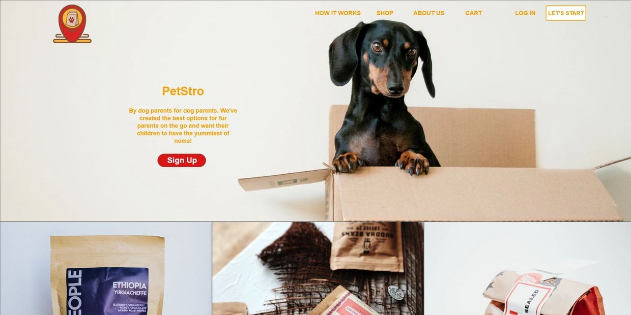
From user research, I learned that there were some pain points for users. The two biggest issues were the size of buttons and the color scheme on mobile devices. The small buttons caused users to select the wrong options. I solved this issue by making the buttons bigger and added colored borders. I also learned that users wanted a more enjoyable experience browsing for dog food products. They commented that the site needed more pictures. They also said that sometimes they came to the site without a specific item in mind. I solved this by making the homepage simple and engaging for the user by adding a “Let’s Start” button in the navigation incase the user still didn’t know where to begin. This made the browsing experience straight to the point and made the user’s overall experience more enjoyable.
UI Ideation: sketches and wireframes
Here’s how I put our users’ needs first. The process below begins with our initial ideas wireframes, then moves to mockups, and finally to the high-fidelity prototype.

Wireframe
In this simple version, you can see how I, the designer approaches solving the user’s needs. The headings are clearly listed and separated by categories, How It Works, Shop, About Us, Cart, Log In, Let’s Start. The website does not include icons for some users do not know the meaning for some and are typed out instead. The homepage includes a general layout and options the user can choose from rather than just relying on the navigation. It gives the user the options of where and when they want to move on in their shopping experience.
Revised wireframes after low-fidelity prototype usability testing
In the revised version, you see the progression of the design based on insights identified from usability test feedback. Design additions include a more detailed homepage with updated navigation that will be shown on all pages.
low-fidelity prototype


Mockup
Now the design really begins to take shape: actual text is used, colors are applied, and images are added. This mockup shows a visual that gives a better idea of the final design

The final polished design
High-fidelity prototype
The design is fully developed and gives a complete picture of the completed design. It addresses the user’s needs for a simple, yet engaging and uncluttered design.
High-fidelity prototype (Mobile)


High-fidelity prototype (Web)


