Case Study: RheuMix
Welcome to RheuMix
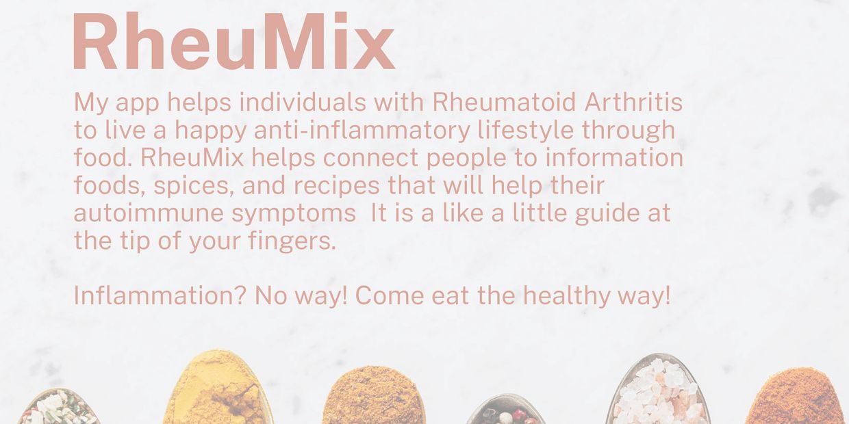
RheuMix is a mobile application to help individuals experiencing inflammation to have a lookup for the food they consume. The typical user is between 25-45 years old and most have a history of autoimmune diseases, inflammation problems, or users who want to change their overall diet. RheuMix is convenient for users who want a quick produce search engine at their hands.
My Role
My role in this project as a UX designer was to take ownership of the app’s design, from concept to delivery. My responsibilities included: user research, wireframing, prototyping, usability testing, iteration, and the creation of a final high-fidelity prototype.
Target user
Users who want to have a quick search engine for inflammation foods.
Research conducted and the research findings
I conducted user research and received feedback from users that were at my disposal. For example, our user Antonia, is a 28-year colleague. The research revealed that Antonia was confused on some of the app navigation and suggested tweaking options for the user. We also learned that Antonia enjoyed the visual look and design of the app.
So, what’s the problem?
The findings on testing, showed that RheuMix needed to omit the loading screen because the users became very confused on what to do when that screen appeared.
Insights learned
I learned that there were some pain points for users after testing a handful of participants. The two biggest issues was the loading screen that made the user frustrated and that the search navigation was a little confusing at first glance so I wanted to make it simple and straightforward for the user.
UI Ideation: sketches and wireframes
Here’s how I put our users’ needs first. The process below begins with my initial ideas of wireframes, then moves to mockups, and finally to the high-fidelity prototype.

Wireframe
In this app, you can see how I, the designer approaches solving the user’s needs. The navigation is shown through icons and when hovered over will tell the user exactly what they are selecting. The user flow is also very simple from signing in to selecting a food item to search. I also added the addition of having an alternative produce option if the item searched was inflammatory.
Mockup
Now the design really begins to take shape: actual text is used, colors are applied, and images are added. This mockup shows a visual that gives a better idea of the final design.

The final polished design
High-fidelity prototype
The design is fully developed and gives a complete picture of the completed design. It addresses the user’s needs for a simple, yet engaging and uncluttered design.
High-fidelity prototype (Mobile)


